Data design for smarter policy workshops
When Policy Lab and the Government Office for Science’s Foresight Team invited the team here at Data Design to visualise the data for their policy workshops about the projected impact of the ageing population, we were – apart from being delighted to be working on a Government project – very much comforted to learn that there is a concerted effort in Westminster to tackle one of the most important policy challenges of our time.
Even more encouragingly, clearly keen to embrace innovative techniques, such as using infographics to summarise the evidence reviews (Data Design’s forte) and Stanford University’s ‘d school’ style rapid prototyping, to help the workshop attendees to come up with creative policy solutions. The future – at least the future of government policy making – looks very bright indeed.
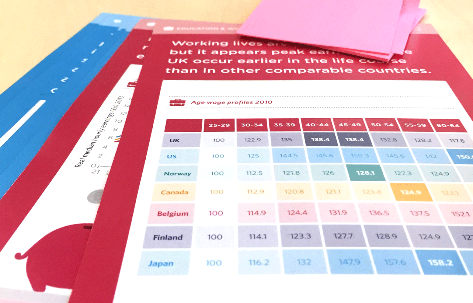
Our start point for the project was to work with Foresight to explore the vast amount of evidence available and to pull out the key evidence points. We would then go on to represent the data and expert opinions as a series of evidence cards. Design has the ability to present stories, however complex, in such a way that users can easily digest them. We used design techniques such as colour and hierarchy to present the ideas in a user friendly way. The evidence cards were colour coded by theme: housing; education and work; health and care; and technology.
Our aim was to instigate more immediate, and, perhaps more importantly, more creative solutions to the policy problems and challenges being faced.
Each theme had an icon as an additional navigational device. Such techniques allow the brain to instantly recognise the area that the cards related to. This, along with the categorical colours, created instant recognition, meaning users could focus on the data quickly and with ease.
Workshopping the problem
The video below shot and edited by Data Design explores how Foresight and Policy Lab used the workshop materials to support policymakers to engage with complex evidence and produce new policy recommendations.
Our aim was to instigate more immediate, and perhaps more importantly, more creative solutions to the policy problems and challenges being faced.
The cards were used for an Evidence Safari, exploring the evidence put together by academics who steer the Foresight Project on the Future of an Ageing Population. The cards were distributed around the room, grouped by evidence type. Groups could pick ‘n’ mix the cards to solve the challenges they had been set. This would form the back bone of the day and inform the idea generation that followed.
In addition, we redesigned a rough map of how different policies relate to an ageing population into a clearer format, employing the same visual techniques as the cards. The policies were grouped by area and the areas were categorised by colour, the same colours assigned to the card groupings.
We are proud to have played a part in merging design with science, evidence and policy making to generate innovative ideas for the challenges and opportunities presented by an ageing population.
Untangling the map was quite a challenge. To logically align these connections in our own minds, we got together in the studio and wrote the policies on coloured post-it notes. We mapped them out on to the wall – a frequent sight in a Shoreditch creative agency! We then arranged them by theme and tried to link them in a way which would result in the least visual confusion. It soon became apparent that a circle was the way to achieve this. We used arrows to indicate the links and where one policy area linked to another we used a gradient to join the two colours across the arrow to aid navigation.
We observed our work being put to use at the policy event on housing. The need for the evidence cards to be quick and easy to understand really hit home when we saw the workshop in action. Each team was only given a short time period for each stage of the process (e.g. 8 minutes to review the ageing population projections, 6 minutes to define the challenge, 15 minutes to prototype a policy idea etc.), so it was crucial that the evidence cards were as clear, unambiguous and visually engaging as possible.
We are proud to have played a part in merging design with science, evidence and policy making to generate innovative ideas for the challenges and opportunities presented by an ageing population. We tend to be biased on our passion for data visualisation but from the feedback we were getting from the workshop attendees, our infographic style cards did prove useful for helping them to quickly understand the key points from such a large range of evidence reviews.
We very much hope to hear of the cards being put to wider use, beyond the four workshops.